The BBC's design language for web, apps, connected TV and voice. Its how-to guides go past components into designing for children and writing error messages that help.
Why we like it
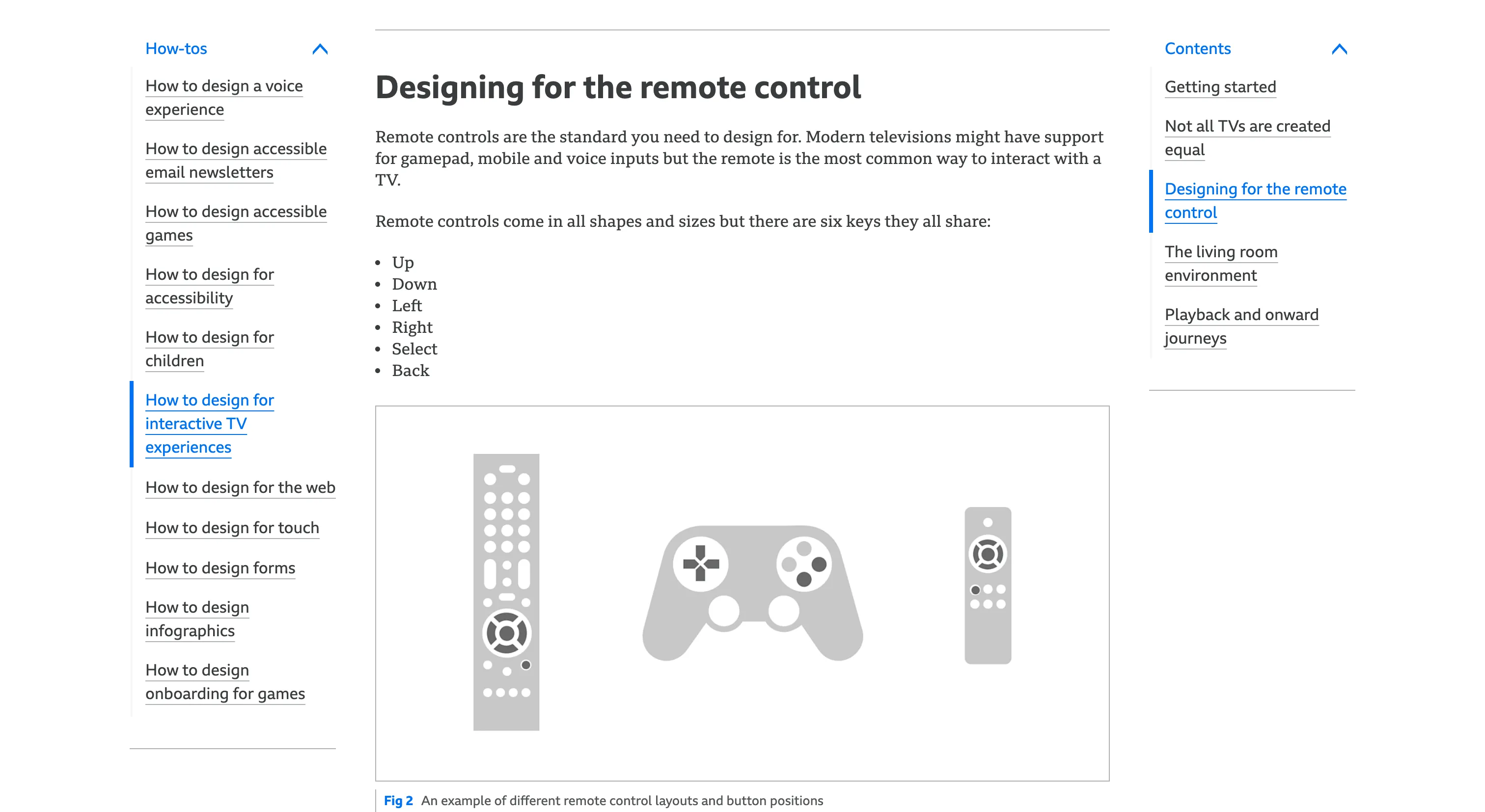
GEL covers ground most design systems never reach. The voice guide comes from building the BBC Kids skill for children aged three to seven, where analytics showed about 40% of what children said was misunderstood. So choices are capped at three, and after two misheard answers the skill picks a surprise instead of asking again. The TV guide designs for the six keys every remote shares and a viewer ten feet away, with home never more than two presses off. The error message guide gives writers three questions to ask and a set of blocks to build from, and only lets the product apologize when the system is at fault.
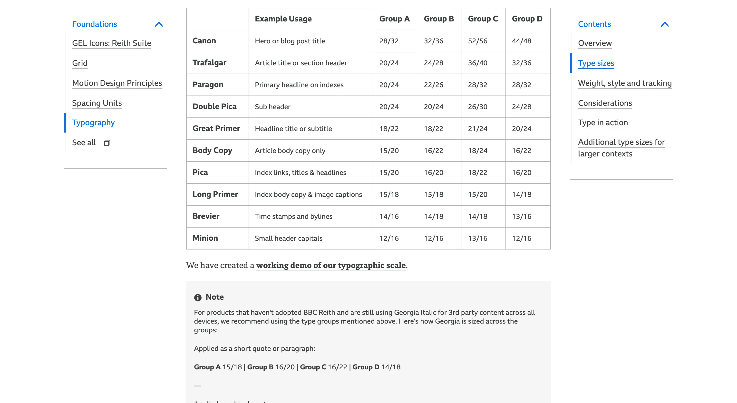
The small details are just as considered. The type scale names its sizes after traditional printing sizes, from Canon and Trafalgar down to Minion, and one breakpoint group switches on whether touch is available as well as on width. The GEL Technical Guides pair patterns with framework-agnostic reference code overseen by the BBC Accessibility Team, and a recent carousel update spells out button labels like "Next, 3 to 5 of 10".
Where it fits
GEL fits large media organizations and anyone designing one estate across web, apps, connected TV, voice and children's products. It's guidance and patterns, not a library to install. The production React system behind BBC Online is internal, and the Technical Guides are reference implementations rather than a package.
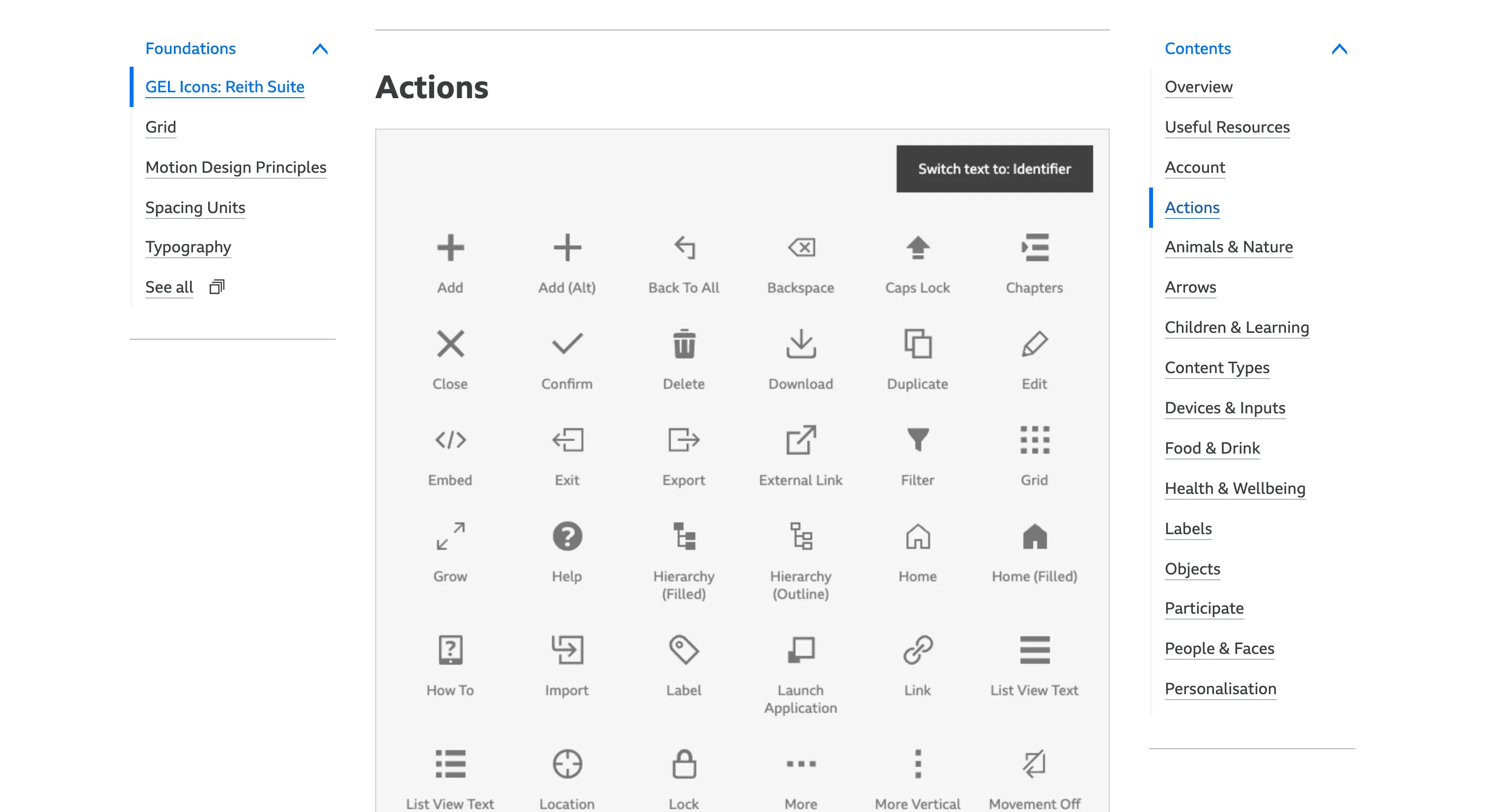
Freshness varies by section. Most guideline pages date from 2015 to 2021, while the icon suite, the Technical Guides and the Sass packages have had updates through 2025 and 2026. The icons can't be modified or used commercially, and the Technical Guides use older conventions like ES5, so read GEL for its thinking more than its assets.
Ideas to borrow
- 01.
Accessibility practice
Pair each pattern with a framework-agnostic reference implementation owned by the accessibility team, plus test scripts teams can run against their own builds.
- 02.
Documentation
Give each guideline its own versioned history page listing changes and named contributors, so readers can see how fresh it is and who owns it.
- 03.
Governance
Build a component only once a second use case appears. The BBC Online team followed that rule closely enough to go months without a Button component.