Design system maintained by Brainly with UI components and design tokens
Why we like it
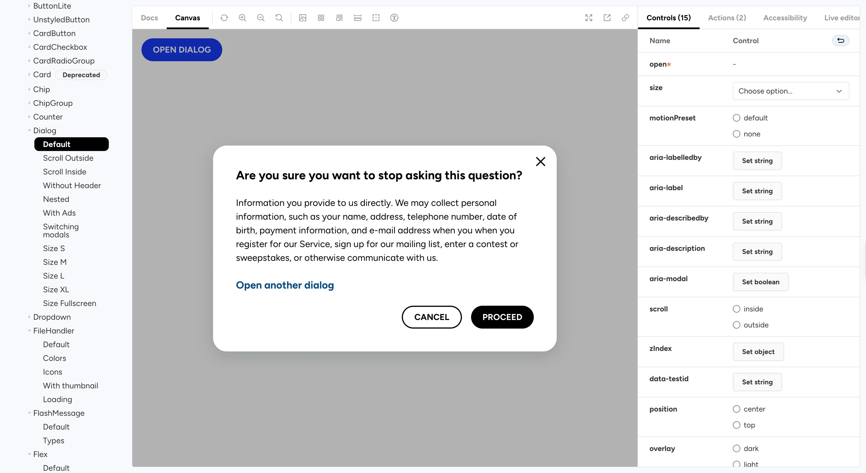
Not every system to study is a flagship, and Brainly's is a good reminder of that. It's a real production style guide on SCSS and BEM, and it ships the same components as both plain HTML and React, so a team can pull it into a React app or a non-React template from one source.
The detail we like is small and practical: it ships its own jscodeshift codemods, with dry-run and glob support, so when something changes, consumers can run a script to bring their code up to date instead of doing it by hand. That's a kindness larger teams often skip.
Where it fits
It fits smaller and mid-size teams who want a lightweight, framework-flexible component set with a real upgrade path, rather than an enterprise-scale platform. The community around it is modest, so lean on it as a reference more than a dependency.
Ideas to borrow
- 01.
Process/automation
Ship codemods alongside your breaking changes, so every upgrade comes with an automated path and the cost lands on the team that made the change, not everyone downstream.
- 02.
Architecture
Deliver the same components as both HTML and JSX from one source, so framework choice doesn't decide who can adopt you.