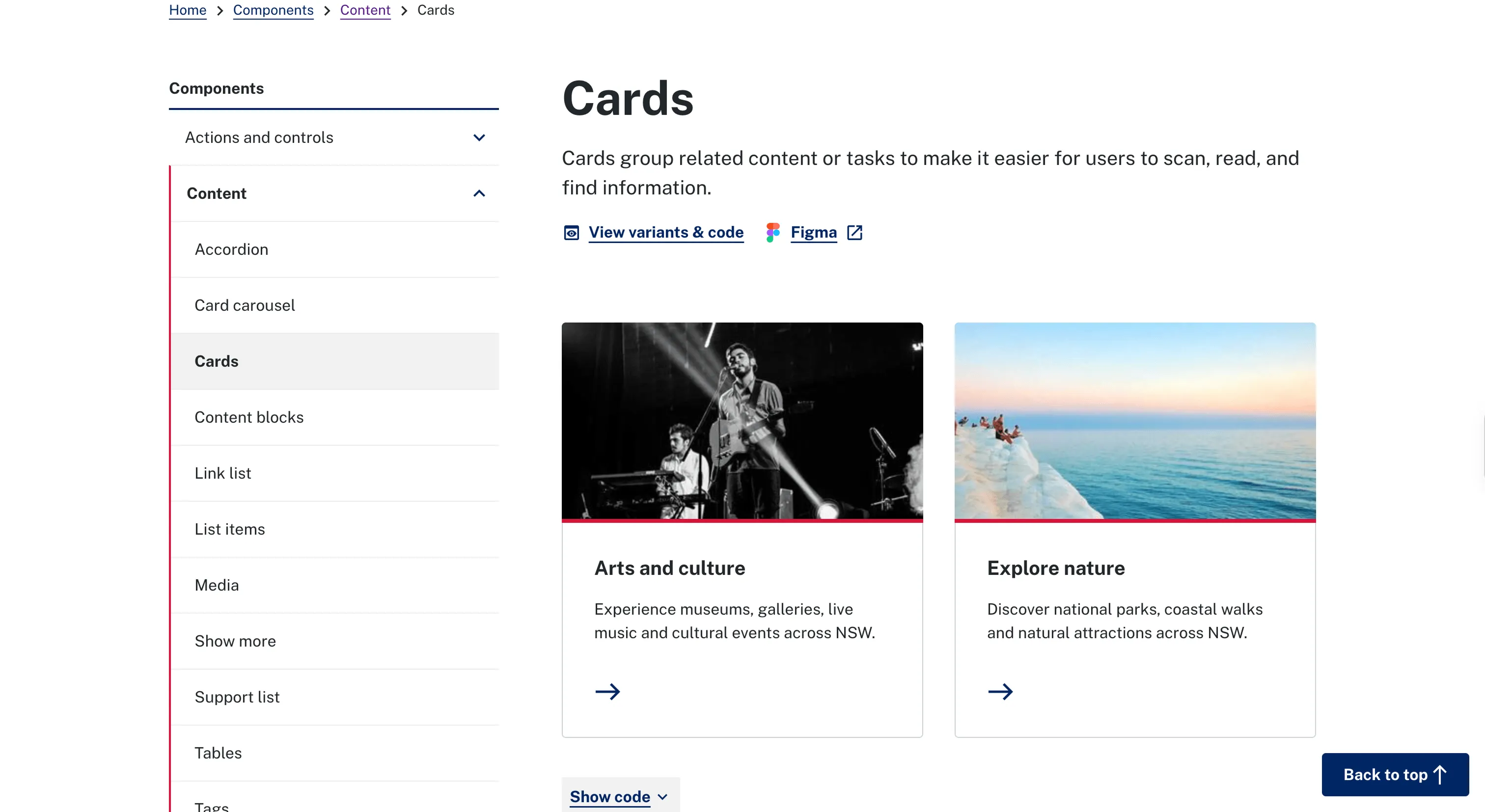
New South Wales' system for state digital services, built for accessible, consistent public-facing interfaces.
Why we like it
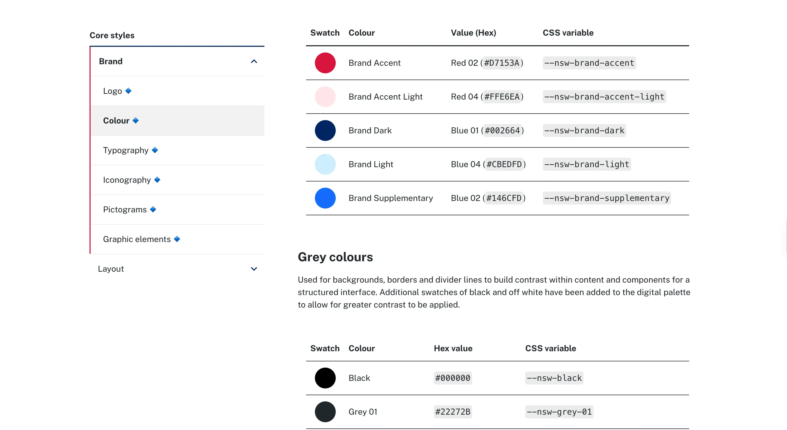
The NSW system has the clearest governance device we've seen for a setup where many agencies share one system. Brand-critical elements, the logo, color, header, footer and masthead, are flagged inline with a small blue diamond, so an agency can see at a glance what it must use to stay compliant and what it's free to adapt.
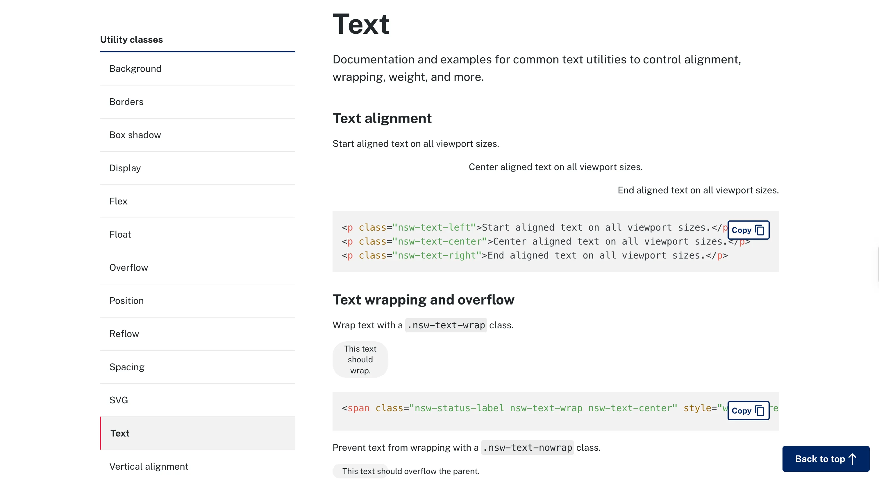
It backs that with the basics done well: MIT-licensed, distributed by npm and CDN, targeting WCAG 2.2 AA, and wiring pa11y accessibility tests into CI so every build is checked. It's candid, too, that component-level compliance still depends on how teams integrate it.
Where it fits
The NSW system fits public-sector and multi-agency teams who have to be both brand-compliant and accessible across groups that don't report to each other. It's a framework-agnostic CSS, JS and Handlebars toolkit rather than a React library, which suits that spread.
Ideas to borrow
- 01.
Governance
Flag which elements are brand-mandatory versus optional right in the system (here, a blue-diamond marker), so teams know what they must not alter without hunting through a policy.
- 02.
Process/automation
Wire accessibility tests (pa11y) into CI, so every component build is checked automatically rather than from memory.