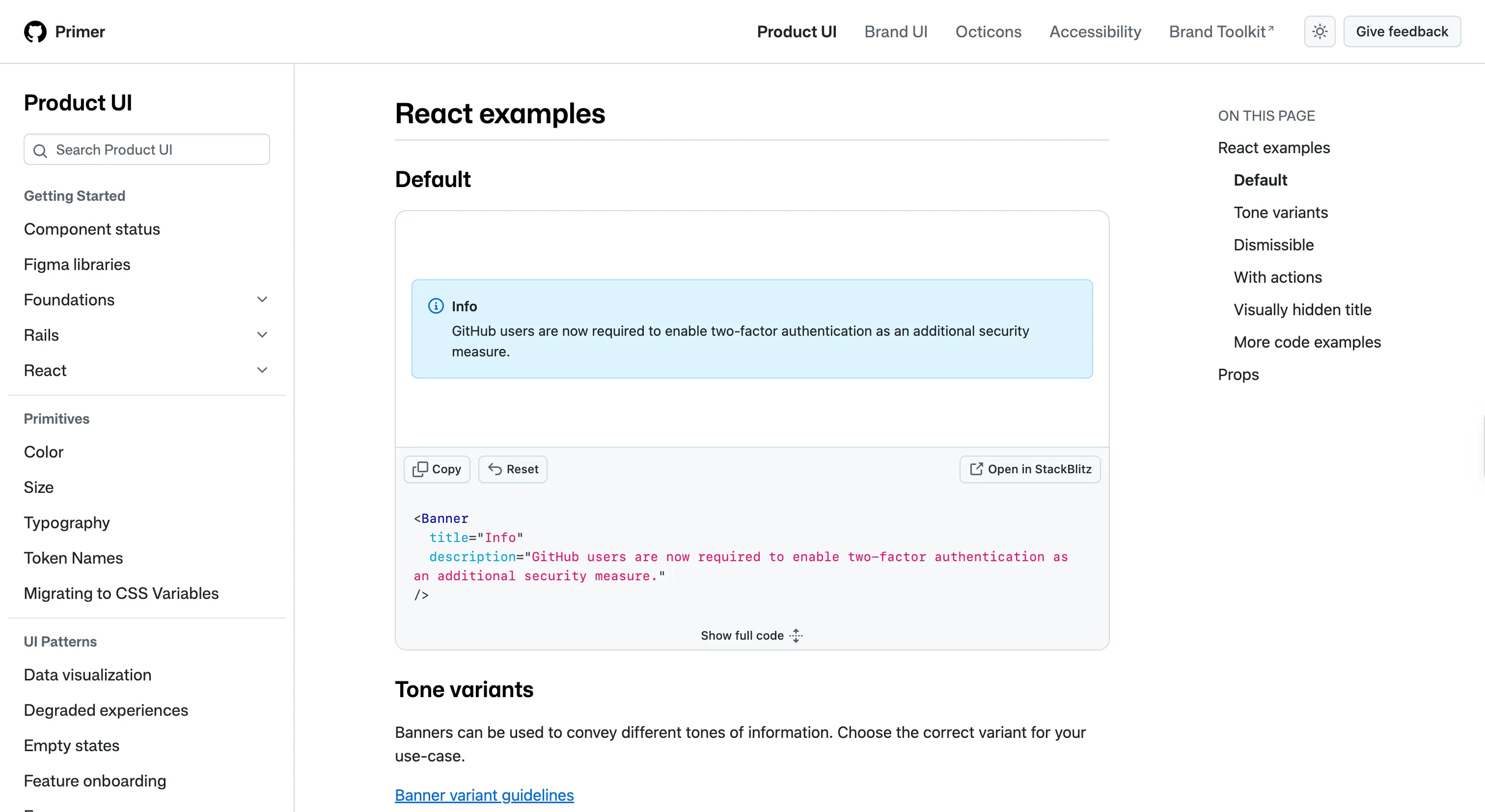
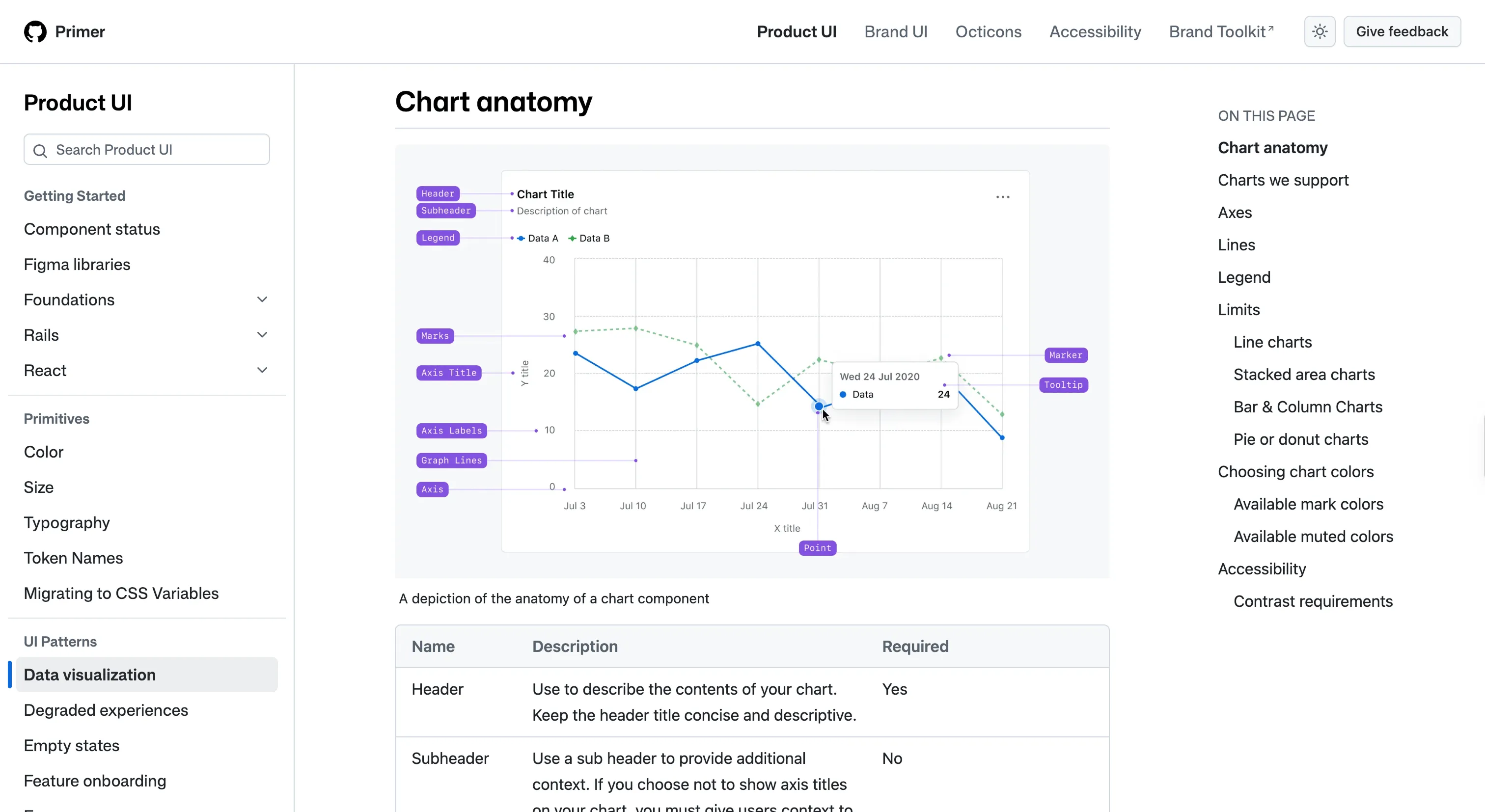
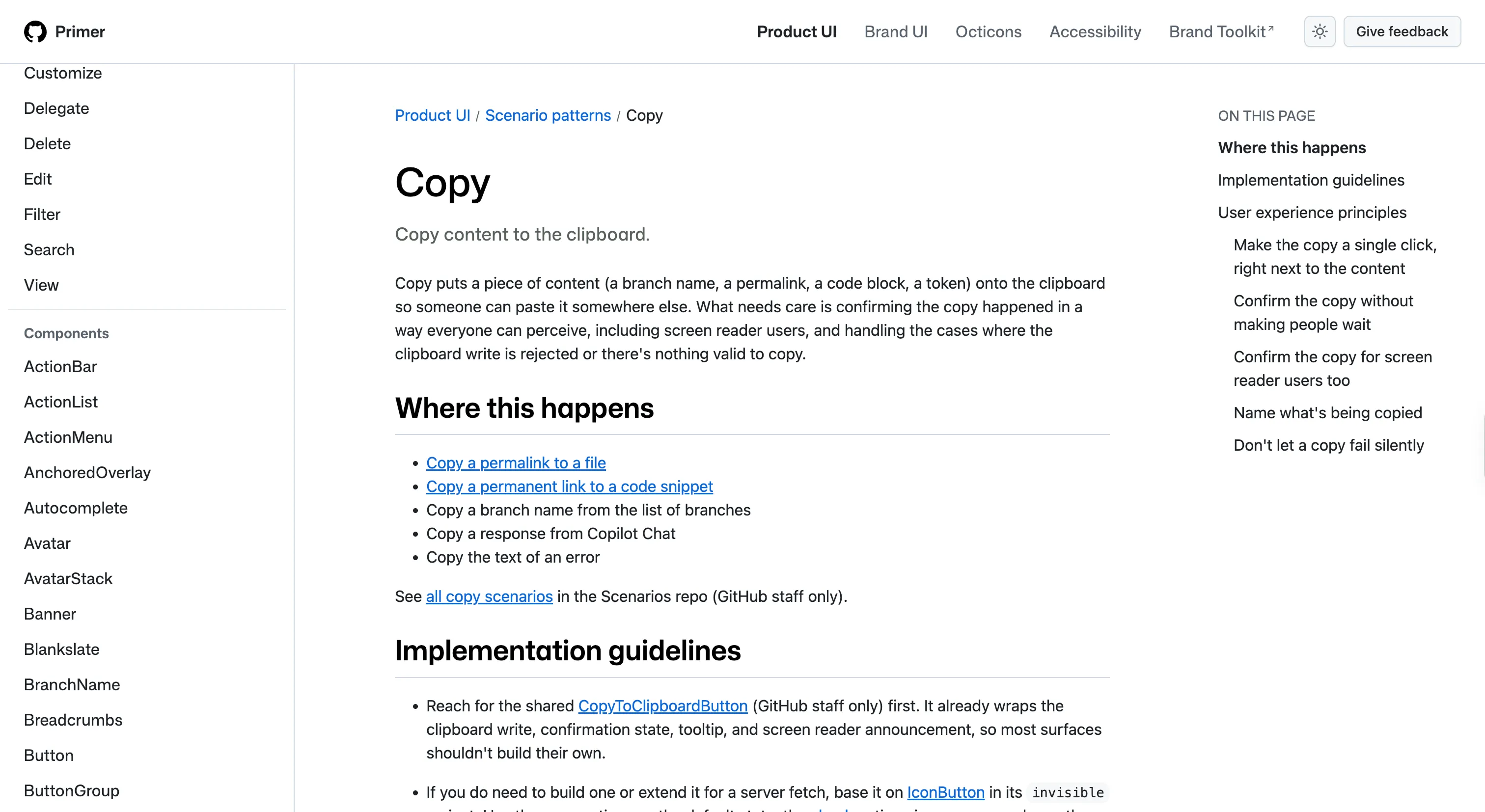
GitHub's system, with visible engineering roots. Tokens and components map closely to how the product is built, and the docs assume you can read code.
Why we like it
Primer shows, about as clearly as anything, what a well-built token layer buys you. Its color system is three tiers deep, base to functional to component, and because components only ever touch the functional layer, GitHub could ship dimmed, high-contrast and color-vision-deficiency themes, nine in all, and resolve more than a thousand accessibility use cases without editing a single component.
Contrast is built into the token contract itself, as enforced pairing rules across a hundred-plus color pairs, so you can't accidentally combine an unreadable foreground and background. The tokens ship as their own package, so Figma and code read from the same decisions.
Where it fits
Primer fits large, long-lived React products with heavy theming and accessibility demands, especially any team that needs several themes (dark, dimmed, high-contrast, color-vision) driven from one token layer. Its docs assume you can read code, which suits engineering-led teams and asks a bit more of design-only ones.
Ideas to borrow
- 01.
Token architecture
Build color in three tiers (base, functional, component) and let components touch only the functional layer, so a new theme is a set of functional values with zero component edits.
- 02.
Accessibility practice
Bake contrast in as enforced color-pair rules, validating each token against the foregrounds and backgrounds it actually pairs with, rather than checking colors in isolation.