SumUp's open-source React system for payments and merchant software, shipped as a monorepo of components, tokens, icons and illustrations under Apache-2.0.
Why we like it
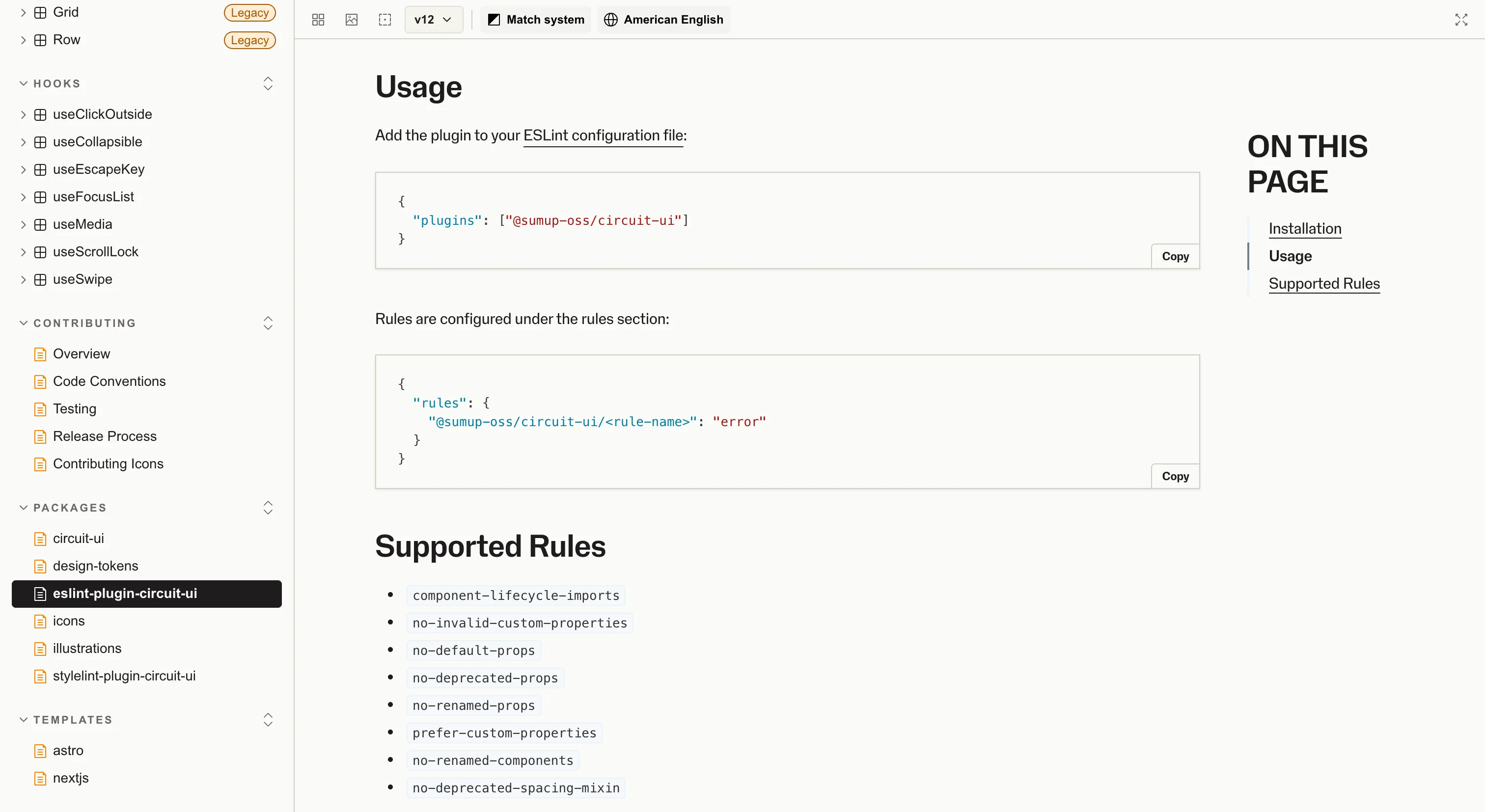
Circuit UI is one of the clearer examples of a fintech taking its system seriously as a product. The repo is a public monorepo with the component library, design tokens, icons, illustrations and a bespoke ESLint plugin all shipped side by side, so a team adopting it gets lint rules enforcing the system's conventions on day one, not as a six-month follow-up.
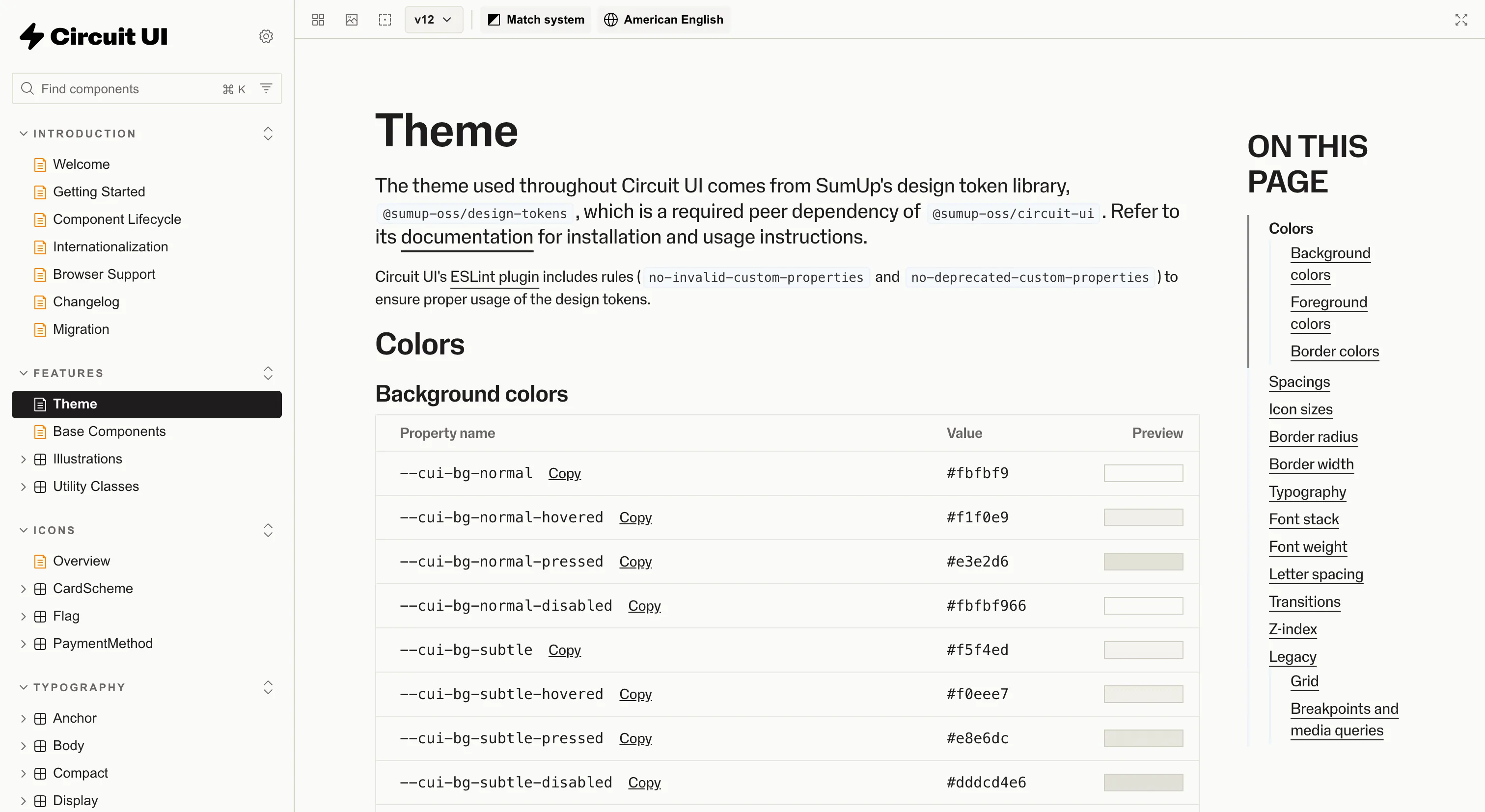
The split into @sumup-oss/circuit-ui and @sumup-oss/design-tokens is also worth paying attention to. The tokens package is published separately, so non-React surfaces (marketing sites, legacy apps, native platforms over time) can consume the primitives without pulling in the component layer. It's a small architectural move that keeps the system useful outside its main runtime.
Where it fits
Circuit UI fits React web teams in payments, fintech or merchant software who want a system that's been pressure-tested at production scale and properly open source. The ESLint plugin is a particularly useful reference for any team thinking about how to encode system rules in a way tooling can enforce.
Good to know: it's React and web only, so native mobile or non-React stacks will only get mileage out of the tokens package rather than the components themselves.
Ideas to borrow
- 01.
Governance
Publish an ESLint plugin alongside your component library that encodes the system's rules (prefer this prop, avoid this pattern, use this token), so adoption and quality show up in CI rather than code review.
- 02.
Architecture
Split tokens, icons and illustrations into separate packages from the components, so surfaces outside your main runtime can consume the primitives without inheriting the component layer.