A collection of accessible React components you copy into your project rather than install as a dependency, built on Base UI or Radix primitives and styled with Tailwind CSS.
Why we like it
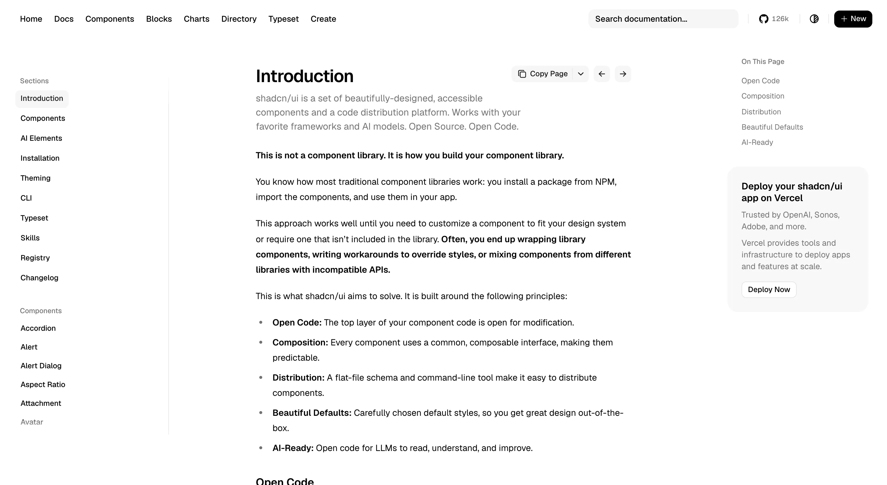
shadcn/ui takes the opposite stance to most component libraries. Instead of publishing an npm package you install and treat as a black box, it ships a CLI that writes component source directly into your repo. You own the files from day one, so bending a Button to fit your product is a normal edit in your own codebase, not a wrapper around someone else's abstractions.
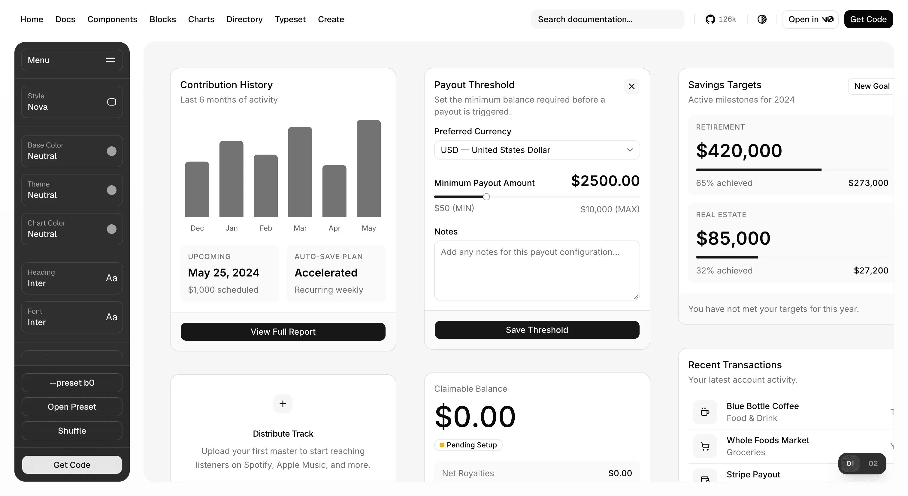
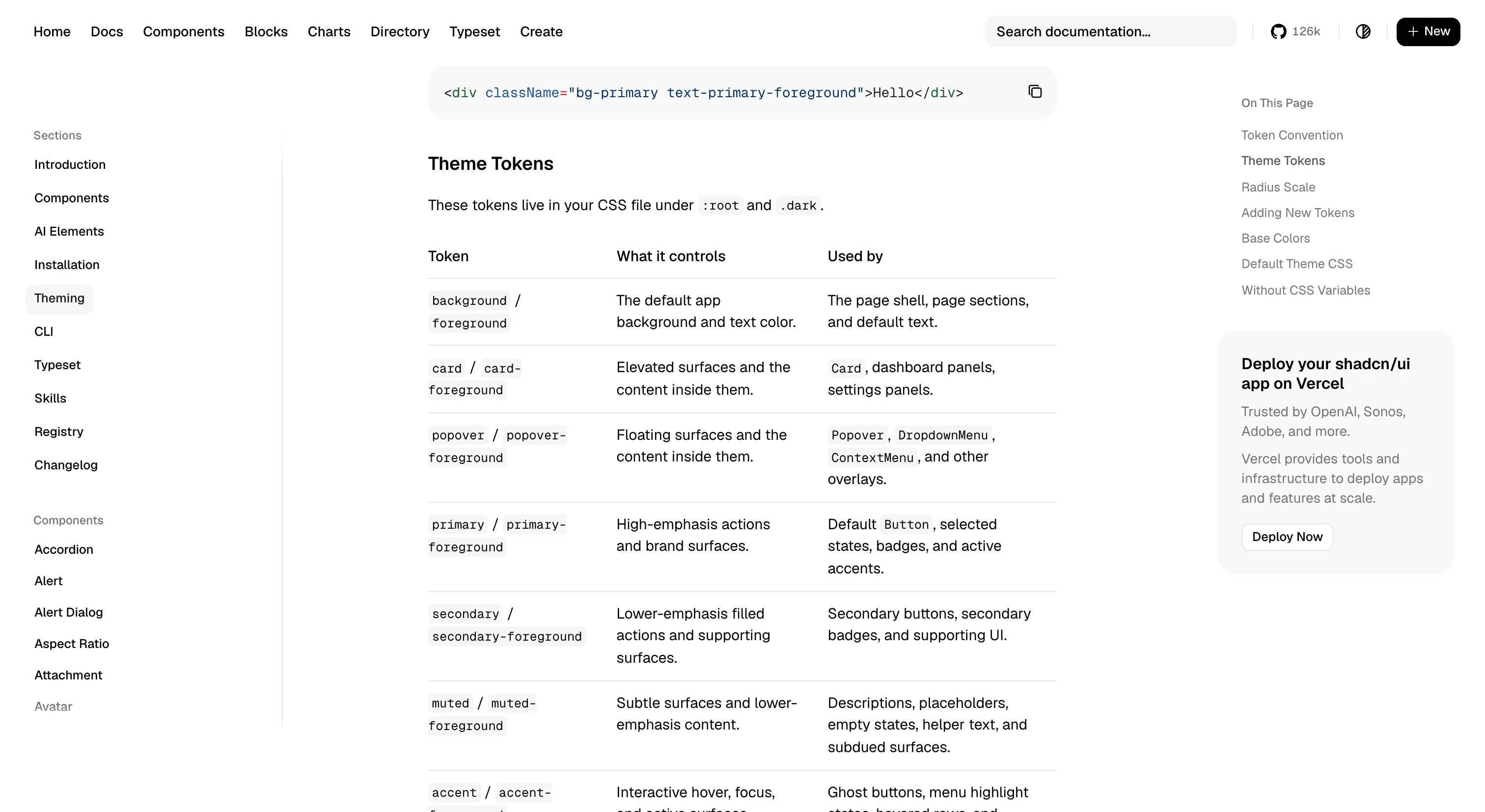
Underneath, every interactive component sits on a headless primitive library, so focus management, keyboard behavior and ARIA semantics are correct before you touch them. Base UI has been the default for new projects since July 2026, but every component still ships for Radix too, and existing Radix projects don't need to migrate. Theming lives in CSS variables and the project ships multiple pre-built themes plus a generator, so a team can color the system to a brand without ever reaching into component source.
Where it fits
shadcn/ui fits React web teams who want accessible primitives, full ownership of the component code and Tailwind as the styling layer. It suits startups and product teams that want to move quickly without inheriting the governance cost of a full component library, and it works well as a starting point for teams that expect to grow their own system over time.
It's React and web only. Community ports exist for Svelte, Vue and Solid, but they're separate projects with their own maintainers, so expect some drift from the canonical version.
Ideas to borrow
- 01.
Distribution
Ship components through a CLI that writes source into the consumer's repository, so teams own the code and customize it in place rather than forking a package.
- 02.
Accessibility
Build on headless primitives so the fiddly behavior (focus traps, roving tabindex, ARIA state) is correct by default, and the system itself is free to focus on tokens and the look.
- 03.
Theming
Expose the theme as plain CSS variables rather than a JavaScript theme object, so themes can be swapped per route, per tenant or per user without a re-render.