Hudl's system, built so one experience stays consistent across many sports, versions, and screens.
Why we like it
Uniform is the most honest governance story here, mostly because Hudl was willing to publish the messy version. An early audit turned up more than fifty different button implementations, every team having rebuilt the same control, and once the system landed, component build time dropped from about two months to roughly two sprints, with full adoption reached inside a year.
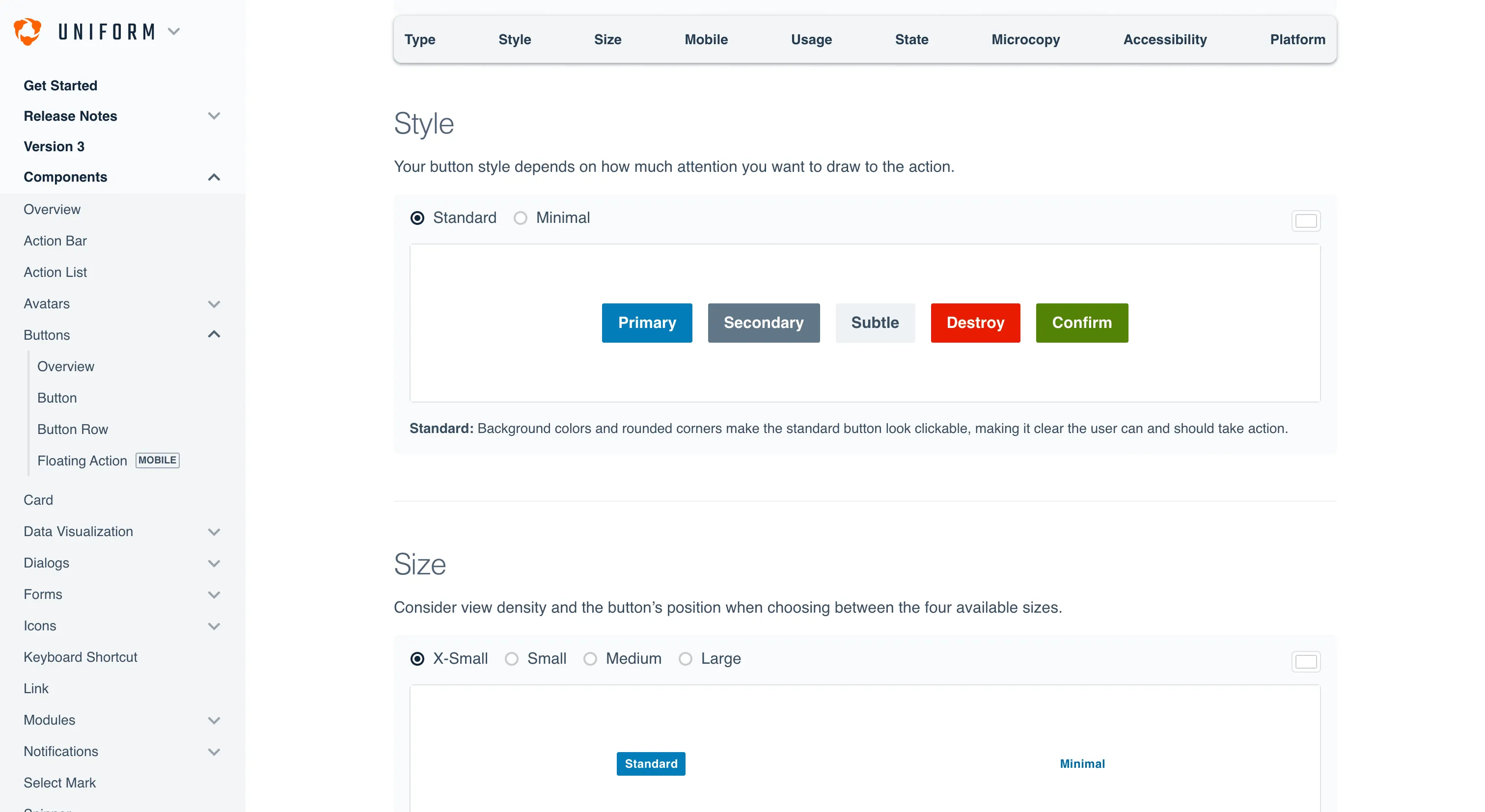
The part we keep coming back to is that they don't stop at the happy ending. Uniform was the third attempt: a federated model and a centralized one had both fallen over first, and the team writes up why each came apart. Even the docs pull their weight, built out of live production components so a broken one shows up the moment the page renders.
Where it fits
Uniform is most useful as a case study for a mid-to-large product org unifying one identity across many teams, especially anyone who's tried and abandoned a purely federated or purely centralized model. It's Hudl's internal system shown publicly as reference, rather than a library to install.
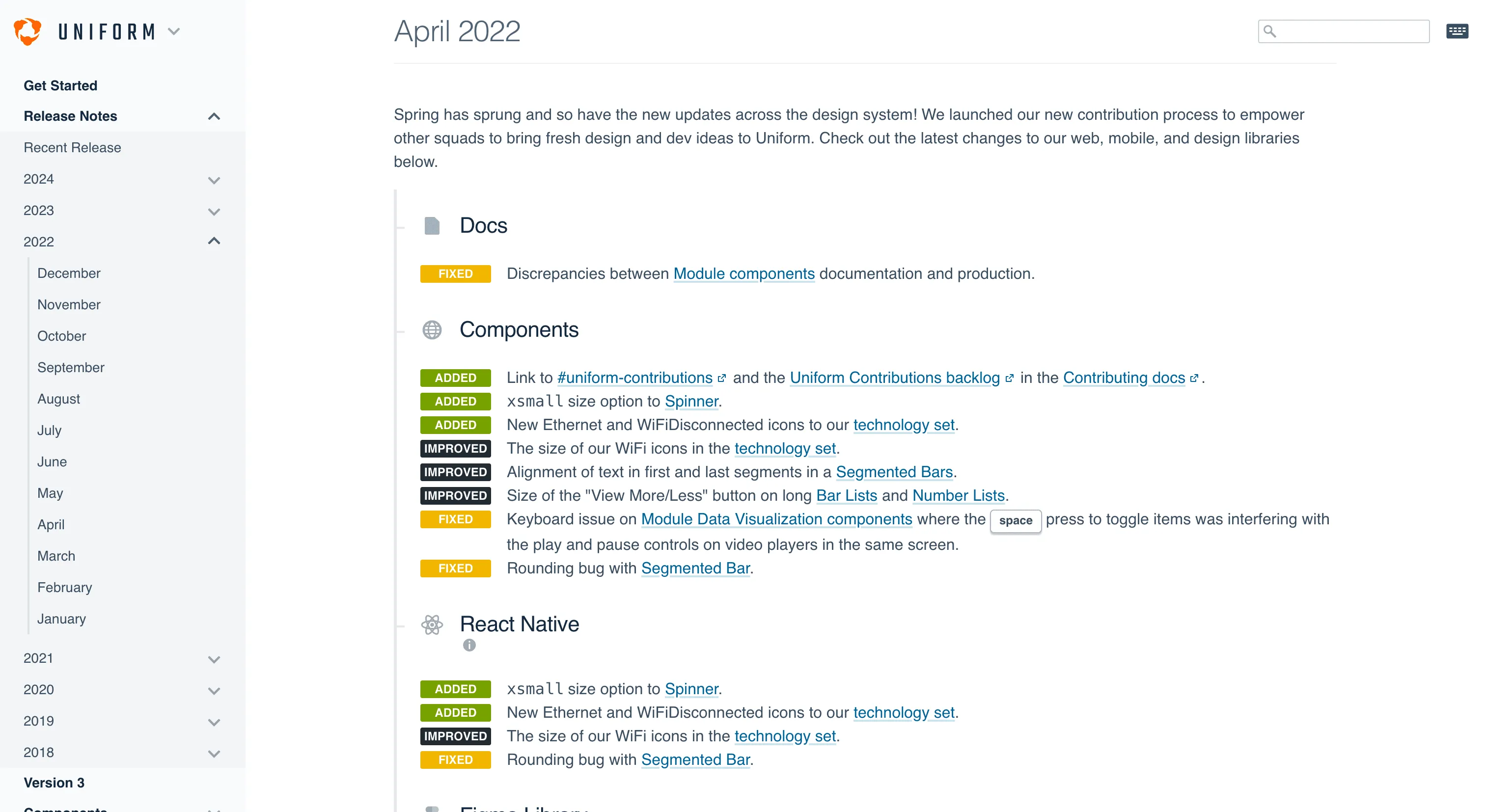
Good to know: the uniform.hudl.com site covers versions before 5, and its release notes stop in January 2024. From version 5, Hudl documents components in a public Storybook instead, so look there for the current API.
Ideas to borrow
- 01.
Governance
Choose your ownership model deliberately. Hudl reached full adoption only after both a federated and a centralized model had failed, and a dedicated owning team plus a contribution path was what worked.
- 02.
Documentation
Build your docs out of real production components, so any broken component is caught the moment the docs render it.