Adobe's system for its creative tools. Built for expert, information-dense interfaces and for consistency across a large, varied app portfolio.
Why we like it
Spectrum's biggest gift to the rest of us is architectural. It splits behavior, state, accessibility and styling into distinct layers: React Aria carries unstyled, screen-reader-tested WAI-ARIA behavior, React Stately the state, React Spectrum the Adobe look, and Internationalized the locale handling for thirty-plus languages including right-to-left. Any team can take the hardest layer, tested accessibility behavior, without adopting Adobe's visuals at all.
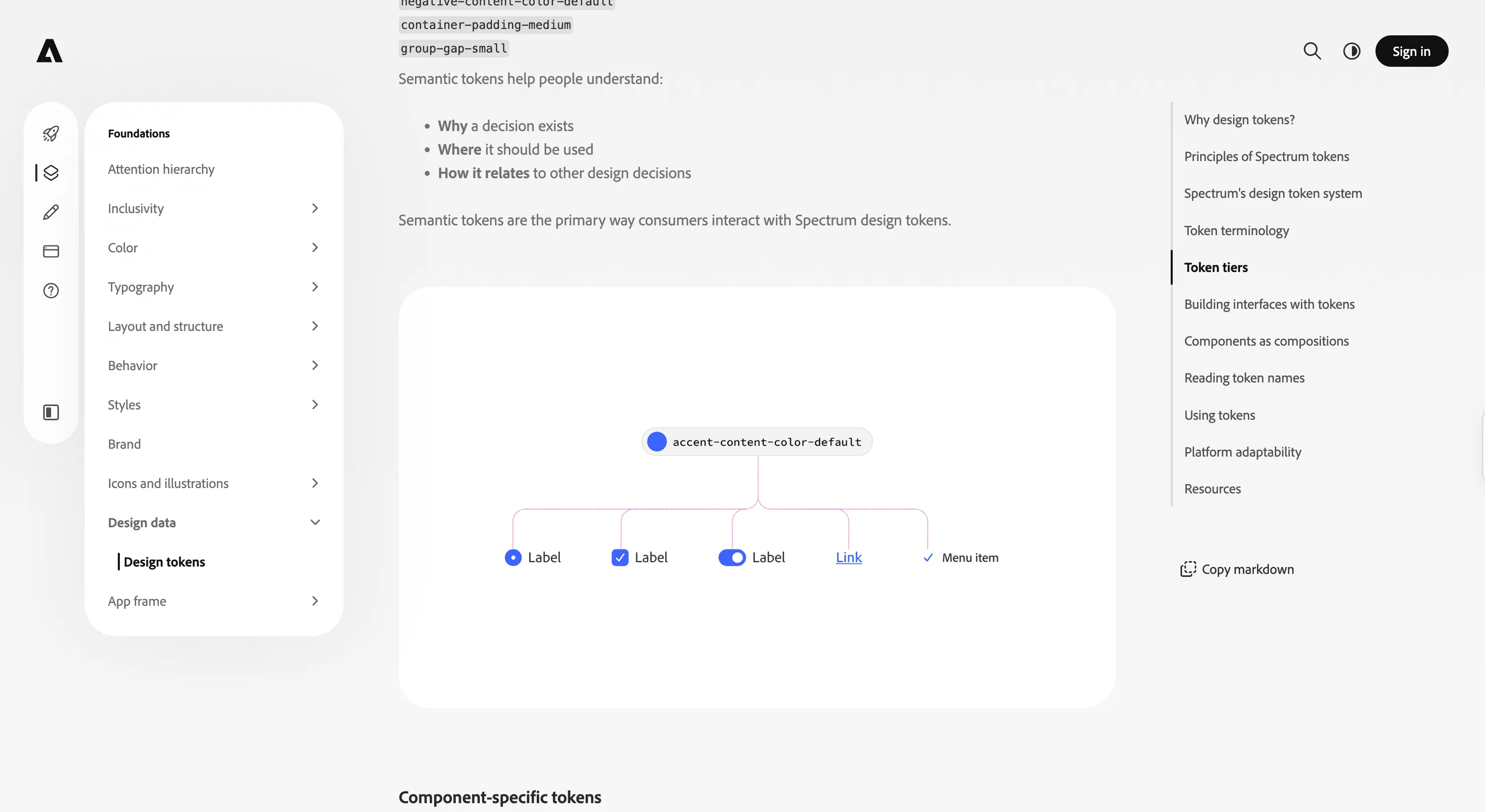
Its tokens are just as considered: a standalone, schema-typed data package with real lifecycle tooling, a diff generator that reports what changed between releases and a changeset generator built on top, so token changes are machine-detectable rather than eyeballed.
Where it fits
Spectrum fits large React product suites that need rigorous accessibility and internationalization, and its layering means you can adopt at any level: React Aria for behavior alone, React Spectrum for the full look, or the typed token data for design tooling. Spectrum 2 is a phased, in-progress migration, so expect movement.
Ideas to borrow
- 01.
Architecture
Split behavior and accessibility (React Aria) from state and from styling, so the hardest-to-get-right layer is reusable by teams that reject your visual style.
- 02.
Process/automation
Treat tokens as schema-typed data with automated diffing and changeset generation, so changes between releases are detected and versioned rather than eyeballed.